In this article we will see how to automatically calculate and draw the mean (average), the median, the standard deviation and the mode of a barchart. For doing this we will use the jqPlot library.
First, let’s start with defining the sequence of input data. Generally this data comes from an external data source and it is not specified within the web page. Often this data is the result of a SQL query on a database, or reading a file (such as .txt, .csv, etc), or an acquisition from a device, or they are the data from a monitoring station or more generally from a sensor. For the sake of clarity, in this example we will directly refer to a sequence of already defined data within an array which we call data.
var data = [15.2,13.0,11.7,12.9,16.9,22.7,26.0,22.7,
            29.7,31.7,21.3,16.7,11.4,6.6,2.7,-5.0,-7.3,-11.3];
In real situations, it is up to us to implement the function, or use functions from other libraries, which will allow us to read data from external sources, making it a parsing to select only the data we are interested in, and if it is necessary, converting it to an appropriate format (often from string to numeric).

If you are interested to know more, inside the book Beginning JavaScript Charts various methods of data acquisition are discussed through several examples, such as the extraction of data from a table in a database (with PHP), such as the reading and parsing the content of external file for using specific data. Moreover, the JSON format is widely discussed, showing the reasons why this format is so widely used.
Furthermore there are various chapters about barcharts along with several examples which explain how to develop a barchart with many different configurations – with horizontal or vertical bars, with stacked or grouped bar, and so on.
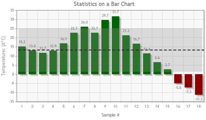
But going back to the example of this article, let’s write a web page integrating the JavaScript functions which refer to jqPlot library. With this code we will obtain the barchart as shown in Fig.2.
<html>
<head>
<title>Statistics on a bar chart</title>
<!--[if lt IE 9]><script type="text/javascript" src="../src/excanvas.js"></script> <![endif]-->
<script type="text/javascript" src="http://code.jquery.com/jquery-1.9.1.min.js"></script>
<script type="text/javascript" src="http://cdn.jsdelivr.net/jqplot/1.0.8/jquery.jqplot.min.js"></script>
<link href="http://cdn.jsdelivr.net/jqplot/1.0.8/jquery.jqplot.min.css" rel="stylesheet" type="text/css" />
<script type="text/javascript" src="http://cdn.jsdelivr.net/jqplot/1.0.8/plugins/jqplot.canvasAxisTickRenderer.min.js"></script>
<script type="text/javascript" src="http://cdn.jsdelivr.net/jqplot/1.0.8/plugins/jqplot.categoryAxisRenderer.min.js"></script>
<script type="text/javascript" src="http://cdn.jsdelivr.net/jqplot/1.0.8/plugins/jqplot.barRenderer.min.js"></script>
<script type="text/javascript" src="http://cdn.jsdelivr.net/jqplot/1.0.8/plugins/jqplot.canvasTextRenderer.min.js"></script>
<script type="text/javascript" src="http://cdn.jsdelivr.net/jqplot/1.0.8/plugins/jqplot.pointLabels.min.js"></script>
<script type="text/javascript" src="http://cdn.jsdelivr.net/jqplot/1.0.8/plugins/jqplot.canvasAxisLabelRenderer.min.js">
</script><script type="text/javascript" src="http://cdn.jsdelivr.net/jqplot/1.0.8/plugins/jqplot.canvasOverlay.js"></script>
<script type="text/javascript" src="arrays.js"></script>
<script class="code" type="text/javascript"> $(document).ready(function(){
var data = [15.2,13.0,11.7,12.9,16.9,22.7,26.0,22.7,
            29.7,31.7,21.3,16.7,11.4,6.6,2.7,-5.0,-7.3,-11.3];
var options= {
    title: 'Statistics on a Bar Charts',
    seriesColors: ['darkgreen'],
    series:[{
         renderer: $.jqplot.BarRenderer,
         rendererOptions: {
              barMargin: 5,
              fillToZero: true
         },
         pointLabels: {
              show: true,
              formatString: '%.1f',
              seriesLabelIndex:1,
              hideZeros:false
         }
    }],
    axes: {
         xaxis: {
              tickRenderer: $.jqplot.CanvasAxisTickRenderer,
              renderer: $.jqplot.CategoryAxisRenderer,
              label: 'Sample #'
         },
         yaxis: {
              labelRenderer: $.jqplot.CanvasAxisLabelRenderer,
              padMin: 0,
              pad: 1.1,
              label: 'Temperatures (°C)',
              rendererOptions: { forceTickAt0: true}
         }
    },
    negativeSeriesColors:['darkred'],
    grid:{
        background: '#f8f8f8'
    }
};
$.jqplot('graph', [data], options ); });
</head>
<body>
<div id="graph" style="height: 400px; width: 700px;"></div>
</body>
</html>
And this is the barchart:
Now our aim is to add the following values to the above barchart:
- mean
- median
- mode
In addition we will show the standard deviation as a shaded area centered on the mean. Finally we will see how to to add a line representing the mean calculated point by point.
Before moving on to the graphics we need to implement a set of functions that carry out statistical calculation on the elements cointained within an array. To this purpose, we write a little library arrays.js, containing all the functions which we will use in the web page. These functions extend the functionalities of the Array object in JavaScript.
Array.prototype.average=function(){
    var sum=0;
    var j=0;
    for(var i=0;i<this.length;i++){
        if(isFinite(this[i])){
            sum=sum+parseFloat(this[i]);
            j++;
        }
    }
    if(j===0){
        return 0;
    }else{
        return sum/j;
    }
}

Array.prototype.stddev=function(){
    var n = 0;
    var sum = 0.0;
    var sum_sq = 0.0;
    for(var i=0;i<this.length;i++){
        n++;
        sum += this[i];
        sum_sq += this[i]*this[i];
    }
    return Math.sqrt( (sum_sq /n) - Math.pow(sum /n, 2));
}

Array.prototype.median=function(){
    var median = 0,
    sorted = [],
    numsLen = this.length;
    sorted = this.slice();
    sorted.sort();
    if (numsLen % 2 === 0) {
        median = (sorted[numsLen / 2 - 1] + sorted[numsLen / 2]) / 2;
    } else {
        median = sorted[(numsLen - 1) / 2];
    }
    return median;
}

Array.prototype.mode=function(){
    //it returns an array. If modal it has only 1 element
    // if multimodal it has n elements
    var modes = [],
    count = [],
    i,
    number,
    maxIndex = 0;
    for (i = 0; i < this.length; i += 1) {
         number = this[i];
         count[number] = (count[number] || 0) + 1;
         if (count[number] > maxIndex) {
              maxIndex = count[number];
         }
    }
    for (i in count)
        if (count.hasOwnProperty(i)){
            if (count[i] === maxIndex) {
                modes.push(Number(i));
            }
        }
    return modes;
}

Array.prototype.average_t=function(){
    var sum=0;
    var j=0;
    var average_t = [];
    for(var i=0;i<this.length;i++){
        if(isFinite(this[i])){
             sum=sum+parseFloat(this[i]);
             j++;
             average_t[i] = sum/j
        }
    }
    if(j===0){
        return 0;
    }else{
        return average_t;
    }
}
Once we have written the library, we need to include it in our web page. Thus, we will add this row to the code.
<script type="text/javascript" src="arrays.js"></script>and let’s make some changes to the JavaScript code.
$(document).ready(function(){
var data = [15.2,13.0,11.7,12.9,16.9,22.7,26.0,22.7,29.7,
31.7,21.3,16.7,11.4,6.6,2.7,-5.0,-7.3,-11.3];
var line = data.average_t();
var options= {
title: 'Statistics on a Bar Chart',
seriesColors: ['darkgreen','orange'],
series:[{
renderer: $.jqplot.BarRenderer,
rendererOptions: {
barMargin: 5,
fillToZero: true
},
pointLabels: {
show: true,
formatString: '%.1f',
seriesLabelIndex:1,
hideZeros:false
}
}],
axes: {
xaxis: {
tickRenderer: $.jqplot.CanvasAxisTickRenderer,
renderer: $.jqplot.CategoryAxisRenderer,
label: 'Sample #'
},
yaxis: {
labelRenderer: $.jqplot.CanvasAxisLabelRenderer,
padMin: 0,
pad: 1.1,
label: 'Temperatures (°C)',
rendererOptions: { forceTickAt0: true}
}
},
negativeSeriesColors:['darkred'],
grid:{ background: '#f8f8f8' },
canvasOverlay: {
show: true,
objects: [
{dashedHorizontalLine: {
name: 'average',
y: data.average(),
lineWidth: 3,
color: 'black',
shadow: false
}},
{dashedHorizontalLine: {
name: 'mode',
y: data.mode()[0],
lineWidth: 3,
color: 'darkred',
shadow: false
}},
{dashedHorizontalLine: {
name: 'median',
y: data.median(),
lineWidth: 3,
color: 'blue',
shadow: false
}}
]
}
};
$.jqplot('graph', [data,line], options );
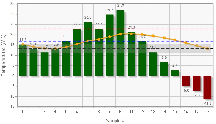
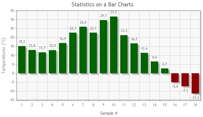
});Now, three new dashed lines are shown in the bar chart (see Fig.3): the median is the blue line, the mean is the balck line and the mode is the red line. The yellow line which floats over the graph is the mean calculated in each bar, in which only the previous points (on its left) are evaluated in the caluclation. At the end, this line will tend to the black dashed line, that is the mean calculated considering all values.

By the end, we can also show the standard deviation as a shaded area centered on the mean line. Let’s add tje following rows of code within the canvasOverlay property.
{rectangle: {
       name: 'stddev',
       ymin: data.average()-data.stddev(),
       ymax: data.average()+data.stddev(),
       color: 'rgba(150,150,150,0.3)',
       shadow: false
}}
Disabling the drawing of the median and mode lines we obtain the following chart: