Before you get started with this article, I suggest you to read the article about Hexagonal Binning. In that article this method of data aggregation is shown and explained in detail. Two scatterplots, generated from two different datasets are compared, and so a class of specific datasets are highlighted. In fact, analyzing “sparse” datasets can be difficult, especially when we are looking for trends or clusters. As solution to this analysis the binning technique is shown, both the simple rectangular binning and more complex hexagonal binning.
The following list shows the two links to the two datasets contained in CSV files:
scatterplot01 : the dataset producing the “sparse” scatterplot;
scatterplot02 : the dataset producing a scatterplot with a good linear trend;
In this article we will show you how to use the rectangular binning and apply it to a generic dataset, using the D3 JavaScript library.
Generally we refer to the method with the term rectangular binning, whereas for the type of chart produced by this technique, we prefer to use the term 2D histogram. This kind of chart combined with a particular color scale produces a heatmap..
In this article we see hot to develop a histogram 2D using the D3 library. Thus we will mainly use the JavaScript programming language.
For those who are not familiar with the development of charts using JavaScript libraries, I suggest to read the book Beginning JavaScript Charts with jqPlot, D3 and Highcharts (Apress 2013). This book contains many examples (over 250 examples) and it is explained, step by step, how to achieve the most common types of charts using various JavaScript libraries.
In the D3 framework, we can find a specific plugin for the hexagonal binning (d3.hexbin.js). This plugin provides the d3.hexbin layout, an essential tool for managing the tessellation of the XY plane into bins and for counting the samples within each hexagonal bin. .Strange to say, there is no layout that handles the binning rectangular, although theoretically much easier.
In fact, giving a look on the internet, you can find several examples of 2D histograms, but they use data that have already been grouped into rectangular bins with the count already entered. So it is up to the user to implement the method of rectangular binning (differently from the hexagonal binning). So first we will see how to implement a plugin that performs the same work performed by d3.hexbin. We’ll call him d3.bin.
In order to implement this plugin, i preferred to start from the d3.hexbin code and then I modified it to achieve a plugin which performs the rectangular binning instead of the hexagonal binning. Download the d3.bin.zip file. This zip file contains the d3.bin.js. Once you extracted the file, place it in the same directory of the HTML page in which you want to perform a rectangular binning. (otherwise you need to change the plugin path in the web page).
To better understand how to use the plugin and how the rectangular binning works, let’s follow, step by step, this small tutorial. For example, let’s consider an XY plane of size 100×100. This is the area in which we want to visualize the dataset. For the sake of clarity we consider a dataset with only three samples.
var points = [[10,10],[0,0],[30,30]]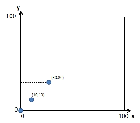
Now, we want to apply the rectangular binning method on this XY plane. For istance, we want to tile it with 20×20 squares (using the side() function). Moreover we want to apply this method on the whole 100×100 area (using the size() function). Thus we have to define:
var binning = d3.bin()
   .size([100,100])
   .side(20);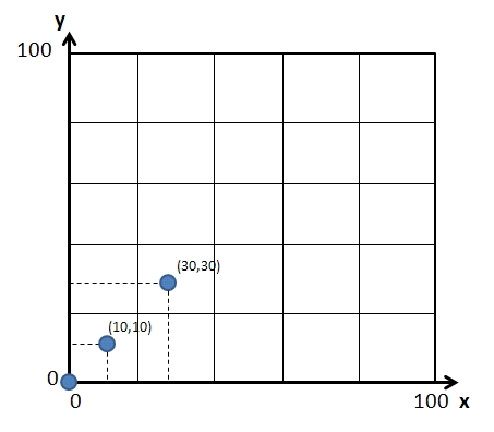
Once we have configured the binning parameters, we need to apply them to the dataset. To this purpose, let’s pass the points array as argument of the binning() function.
var bins = binning(points);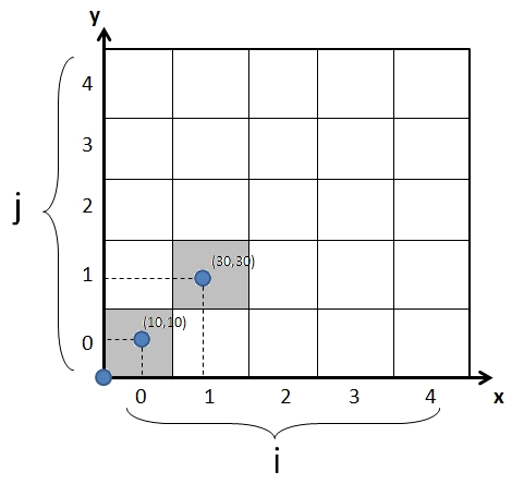
Fig.4 shows the result of the rectangular binning. We can see that 16 bins with 20×20 size are been created. Each bin is indexed by two integer values: i and j. In addition we can notice that only two bins are occupied: the (i=0,,j=0) bin has a the count = 2, and the (i=1,j=1) bin has count = 1. If we now analyze the content of the bins variable we achieve the following data structure:
[ [[0,0],[10,10]] i=0, j=0, x=0, y=0,
[[30,30]] i=1, j=1, x=20, y=20 ]
Indeed, we find only two bins stored in the bins variable ( bins with count = 0 are not considered in binning method). Each bin is represented by an array containing the points enclosed in the area covered by the bin, the i and j indexes, and the x and y values that are the coordinate of the bottom left vertex of the square.
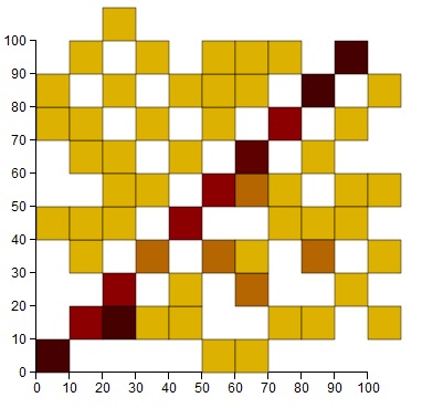
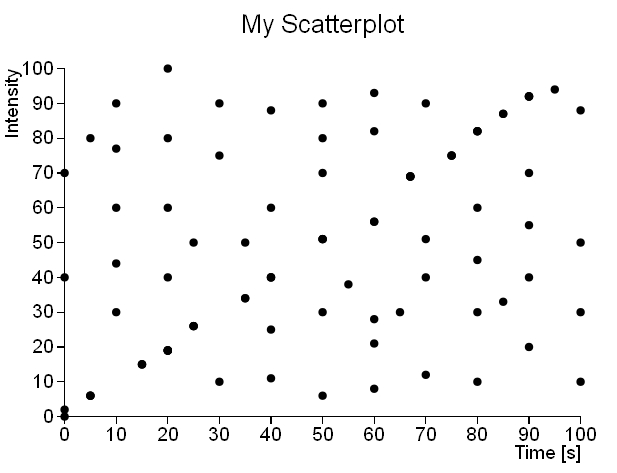
Thus, using this plugin we can apply the rectangular binning to any dataset, to thereby produce a data structure useful for the visualization of 2D histograms. In this article we will refer particularly to the dataset in the scatterplot01.csv file. This dataset produces the following 2D histogram (see Fig.5).
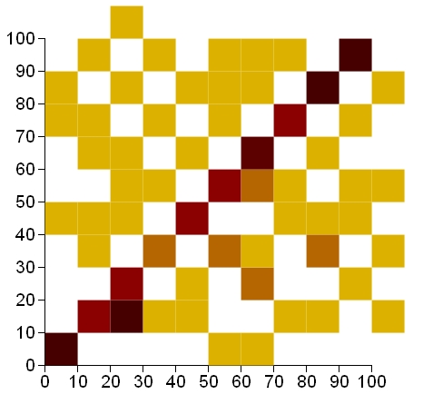
As you can see in Fig.5, unlike the corresponding scatterplot, the linear trend is evident. This is due to the fact that a scatterplot does not take account of the overlapping points, or of their density. The scatterplot is indeed a fast way to see how a set of data is distributed in space, but as we have just experienced, it is certainly not the proper way to display the density of points in the XY plane. But now let’s look at the Web page code producing the 2D histogram in Figure 5. Then we will pass to analyze some of its parts.
<!DOCTYPE html>
<html>
<head>
<meta charset="utf-8">
<script src="http://d3js.org/d3.v3.min.js"></script>
<script src="d3.bin.js"></script>
<style>
body {
    font: 12px sans-serif;
}
.axis path, .axis line {
    fill: none;
    stroke: #000;
    shape-rendering: crispEdges;
}
.square {
    stroke: #fff;
    stroke-width: .5px;
}
</style>
</head>
<body>
<script type="text/javascript">
var margin = {top: 40, right: 40, bottom: 40, left: 40},
    w = 380 - margin.left - margin.right,
    h = 380 - margin.top - margin.bottom;
var color = d3.scale.linear()
    .domain([0, 3])
    .range(["yellow", "darkred"])
    .interpolate(d3.interpolateLab);
var x = d3.scale.linear()
    .domain([0, 100])
    .range([0, w]);
var y = d3.scale.linear()
    .domain([0, 100])
    .range([h, 0]);
var yinv = d3.scale.linear()
    .domain([0, 100])
    .range([0, h]);
var xAxis = d3.svg.axis()
    .scale(x)
    .orient("bottom");
var yAxis = d3.svg.axis()
    .scale(y)
    .orient("left");
var side = 10;
var bins = d3.bin()
    .size([w, h])
    .side(side);
var svg = d3.select("body").append("svg")
    .attr("width", w + margin.left + margin.right)
    .attr("height", h + margin.top + margin.bottom)
    .append("g")
    .attr("transform", "translate(" +margin.left+ "," +margin.top+ ")");
var points = [];
d3.csv("scatterplot01.csv", function(error, data) {
    data.forEach(function(d) {
        d.time = +d.time;
        d.intensity = +d.intensity;
        points.push([d.time, d.intensity]);
    });
    svg.append("g")
        .attr("class", "x axis")
        .attr("transform", "translate(0," + h + ")")
        .call(xAxis);
    svg.append("g")
        .attr("class", "y axis")
        .call(yAxis);
    svg.selectAll(".square")
        .data(bins(points))
        .enter().append("rect")
        .attr("class", "square")
        .attr("x", function(d) { return x(d.x); })
        .attr("y", function(d) { return y(d.y)-yinv(side); })
        .attr("width", x(side))
        .attr("height", yinv(side))
        .style("fill", function(d) { return color(d.length); }); }); </script>
</html>
An important point to keep in mind it is the size of the squares with which to perform the binning. In fact, depending on the distribution of the data and the dataset that we are analyzing, we will need to adjust the size of the bins. Considering the fact that dataset covers a range of 0-100 for both the x-axis and the y-axis, and it does not contain so many elements (only 3) I choose to use squares with side 10 (it is the numerical value not pixels!)
var side = 10;
var bins = d3.bin()
.size([w, h])
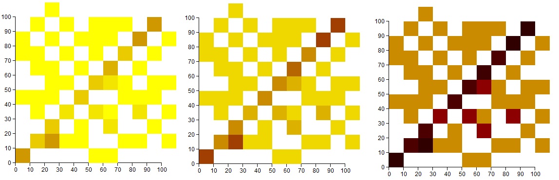
.side(side);In Fig.6 we can see how the chart varies with the size of the squares.
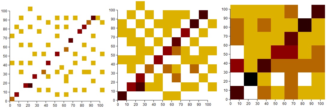
Another parameter to adjust is the gradation of color to apply depending on the dataset points contained in each bin. For this example I used yellow for the lowest values and dark red for the highest values. In defining the color scale, you can adjust the gradient color by defining a range within the domain() function. In this example I set yellow when the count = 1 (don’t forget that bin containing no samples are not represented) and the dark red when count = 3. If the count is greater then the color tends to an even darker gradation (black).
var color = d3.scale.linear()
    .domain([0, 3])
    .range(["yellow", "darkred"])
    .interpolate(d3.interpolateLab);
In Fig.7 we can notice as the appearance of the charts changes as adjusting the color range.
Furthermore it is possible to add black borders to each bin modifying the CSS styles.
.square {
    fill: none;
    stroke: #000;
    //black stroke
    stroke-width: .5px;
}