The Confusion Matrix
The confusion matrix is a widely used evaluation tool in machine learning to measure the performance of a classification model. It provides a detailed overview of the predictions made by the model against the real classes of data. The confusion matrix is particularly useful when working with classification problems where there may be more than two classes.
The confusion matrix is organized in a table, where each row represents the real class and each column represents the class predicted by the model. The leading diagonal of the matrix represents correct predictions (true positives and true negatives), while cells off the diagonal represent misclassifications (false positives and false negatives).
Here’s how the confusion matrix works:
- True Positives (TP): Number of cases where the model correctly predicted a positive class..
- True Negatives (TN): Number of cases where the model correctly predicted a negative class.
- False Positives (FP): Number of cases in which the model incorrectly predicted a positive class when it was actually negative (false alarm)..
- False Negatives (FN): Number of cases where the model incorrectly predicted a negative class when it was actually positive (failed to detect).
The confusion matrix can help you understand what kind of errors your model is making and which class is performing better or worse. From these values, you can calculate various evaluation metrics such as accuracy, precision, recall and F1 score.
The Confusion matrix as an analysis tool
The confusion matrix is an important tool for evaluating the performance of a classification model in detail. In addition to calculating baseline values such as true positives, true negatives, false positives, and false negatives, you can use these values to calculate various evaluation metrics that provide a more comprehensive view of model performance. Here are some of the more common metrics calculated by the confusion matrix:
1. Accuracy: Accuracy measures the proportion of correct predictions out of the total number of predictions. It is the simplest metric but can be misleading when classes are unbalanced.
2. Precision: Precision represents the proportion of true positives out of the total positive predictions made by the model. Measures how accurate the model is when making positive predictions
3. Recall (Recall or Sensitivity): Recall represents the proportion of true positives to the total of actual positive instances. Measures the model’s ability to identify all positive instances.
4. F1 Score: The F1 Score is the harmonic mean between accuracy and recall. It’s useful when you want to strike a balance between accuracy and recall.
5. Specificity: Specificity represents the proportion of true negatives to the total number of actual negative instances. Measures how good the model is at identifying negative instances.
6. ROC Curve (Receiver Operating Characteristic Curve): The ROC curve is a graph showing the relationship between the true positive rate and the false positive rate as the classification threshold varies. As the threshold varies, ROC points are drawn and connected, and the area under the ROC curve (AUC) can be used as a measure of model effectiveness.
These metrics can provide a deeper insight into model performance than a simple accuracy percentage. It’s important to select the metrics that are most relevant to your problem and the balance of accuracy and desired recall.
Remember that these metrics are useful tools for evaluating models, but you should always consider the context of the problem and the nature of your classes before drawing conclusions about model quality.
A practical example
Here’s an example of how to use the confusion matrix in Python:
import matplotlib.pyplot as plt from sklearn.datasets import load_iris from sklearn.model_selection import train_test_split from sklearn.ensemble import RandomForestClassifier from sklearn.metrics import plot_confusion_matrix #Load the Iris datasetiris = load_iris() X = iris.data y = iris.target #Divide the dataset into training and test setsX_train, X_test, y_train, y_test = train_test_split(X, y, test_size=0.2, random_state=42) #Create and train a classification model (Random Forest)model = RandomForestClassifier() model.fit(X_train, y_train)
In this example, we are using the RandomForestClassifier as a model to carry out a classification on an example dataset such as that of the IRIS flowers included in the same sklearn library to carry out tests, as in our case. Once the model has been created and trained with the fit() method, we can test it.
y_pred = model.predict(X_test)
y_pred
array([1, 0, 2, 1, 1, 0, 1, 2, 1, 1, 2, 0, 0, 0, 0, 1, 2, 1, 1, 2, 0, 2,
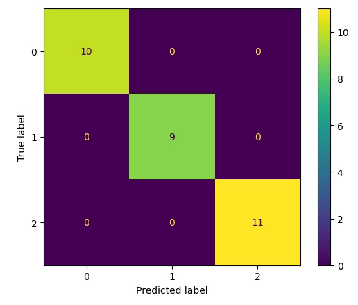
0, 2, 2, 2, 2, 2, 0, 0])We get an array with the expected membership classes of IRIS flowers (0,1 and 2). Now we can apply the confusion matrix by comparing the predicted results (y_pred) with the actual results of the y_test array. Regarding the confusion matrix, we don’t need to implement anything new, but we have the method already present in the sklearn library under the metrics module. We then calculate the confusion matrix with the following code:
cm = confusion_matrix(y_pred, y_test)
cm

array([[10,  0,  0],
       [ 0,  9,  0],
       [ 0,  0, 11]], dtype=int64)
Visualization of the Confusion Matrix
Now that we know how to obtain the values of the confusion matrix with respect to any model used, let’s move on to see how it is possible to display them in a more appropriate and graphical way. A way to display the confusion matrix is provided to us by the same sklearn.metrics module, it is the ConfusionMetrixDisplay class.
disp = ConfusionMatrixDisplay(confusion_matrix=cm,
                               display_labels=clf.classes_)
disp.plot()
plt.show()
Executing you get the following result.
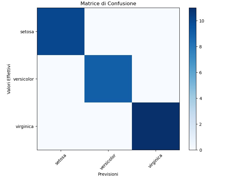
If you don’t want to use the ConfusionMetrixDisplay object, the matplotlib library provides us with all the tools needed to work graphically and provide alternative graphics of a confusion matrix. For example, you can view it as a HeatMap in the following way:
# Visualizza la matrice di confusione come una heatmap
plt.figure(figsize=(8, 6))
plt.imshow(cm, interpolation='nearest', cmap=plt.cm.Blues)
plt.title("Matrice di Confusione")
plt.colorbar()
plt.xticks(np.arange(len(iris.target_names)), iris.target_names, rotation=45)
plt.yticks(np.arange(len(iris.target_names)), iris.target_names)
plt.ylabel("Valori Effettivi")
plt.xlabel("Previsioni")
plt.show()
Running the code you get the following graph: