This article is an extension of the article Hexagonal Binning in which this method of data aggregation is shown. It starts showing how a dataset is represented in scatterplot and concludes showing it with a visual representation using hexagonal bins. The charts shown in the article are all generated using the D3 JavaScript library.
In this article, we will see how to apply various analyzes to a dataset (in CSV format) using only the D3 library. By way of example, we will use two dataset contained in two different CVS files. First we will see how it is possible plotting them as scatterplots, and then, once we have performed a hexagonal binning on them, we will show them in a hexagonal heatmap chart.
(In another article the rectangular binning is discussed).

For those who are not familiar with the development of charts using JavaScript libraries I suggest to read the book Beginning JavaScript Charts with jqPlot, D3 and Highcharts. This book contains many examples (over 250 examples) in which it is explained, step by step, how to develop the most common types of charts using various JavaScript libraries.
These are the two datasets contained in CSV files.
- scatterplot01 : it is a “sparse” dataset
- scatterplot02 : it is a dataset producing a linear trend
To better understand how the two datasets are distributed in a XY plane, let’s implement a web page that is able to produce a scatterplot chart. The code of the web page is below. Once copied into a text editor, save it as scatterplot01.html.
This page reads the content of the scatterplot01.csv file. In order to do the same thing with the second file, replace the file name with the new one, as shown here:
d3.csv("scatterplot02.csv", function(error, data) {and save the web page as scatterplot02.html.
This is the scatterplot produced with the dataset contained in the scatterplot02.csv file.
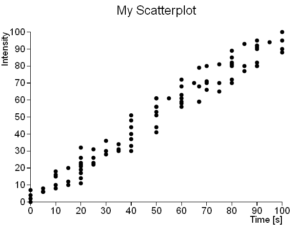
and this is the scatterplot produced with the dataset contained in the scatterplot01.csv file.
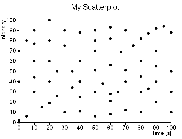
As we can see, it is readily apparent that the scatterplot02 dataset follows a linear trend, while the scatterplot01 dataset does not show any particular trend or cluster. So, while in the first case a scatterplot representation may be sufficient to perform an analysis on the dataset, in the second case it is necessary to apply a different method of analysis, which also takes account of the density distribution of the points in the space represented by the XY plane. A very efficient method of aggregation to be applied to the dataset “spread” is precisely the hexagonal binning.
The D3 library provides us with a plugin which is specialized for this type of analysis: d3.hexbin.js. This plugin contains a d3.layout (d3.hexbin) which is able, once a dataset is provided, to perform a hexagonal binning on it, generating a corresponding data structure. This data structure contains the bins in which the XY plane is divided, each bin is indexed by the i and j values, the points that each bin contains, the coordinate of the center of the hexagon and finally the counting of points enclosed in it. Thanks to the values contained in this data structure it is up to the D3 library to convert these data into graphics.
This is the code of the web page which allows us to perform the hexagonal binning on datasets.

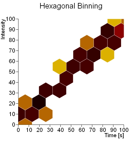
As we can see in Fig.3, where before we had a uniform distribution, it is evident a linear trend marked by a set of dark hexagons that cut diagonally across the XY plane.
If we apply the hexagonal binning to the other dataset, we obtain the following chart:
As you can see, it is almost superfluous to apply this kind of analysis to this type of dataset.